

Essential Components for a Compelling Homepage
- Kristy Ueda
- Oct 31, 2023
- 6 min read

Updated: Nov 9, 2023

Your homepage is one of the highest selling touch points for your brand. It's the main tool to make a great first impression on your audience, educate about your product and increase conversion. With that said, your homepage must be built with intention, strategy and purpose. Below are a few crucial components to make your homepage compelling so that your audience wants to know more about your product or service.
01 / Change how you talk about your product/service
According to research, websites have to tell a viewer what the business offers within three seconds.
This means your homepage only has a few seconds to communicate your product/service while making a good first impression. The message on your header (and throughout your website) should captivate your audience and draw them into wanting to know more about your product or service. It’s very important to note that this statement shouldn’t be how great your product is, but how it can benefit your audience.
T I P
Draw your audience in by showing empathy – state how your product can make their lives better, easier or more fulfilled.
People are constantly looking to fulfill a certain category in their lives, whether that's being part of a tribe, finding purpose/meaning, or just living a more fulfilling life. How can your product provide fulfillment in one of those areas?
For example, let's say your product is a specially made pillow for those who have trouble sleeping. Instead of having the header statement as "Our pillows are made of the best hypoallergenic material", change it to be "Get the best sleep of your life. No more restless mornings".
What's the difference here? The first statement shows how great your product is, which is okay! But it doesn't exactly draw your audience in by telling them what your product can do for them. It only tells them how great your product is without telling them how they can benefit from it. The second statement, however, paints a picture of what your audience is hoping for: the best sleep of their life and no more restless mornings. Show them the ideal life that they can have if they buy your product.
Here are a few more examples:
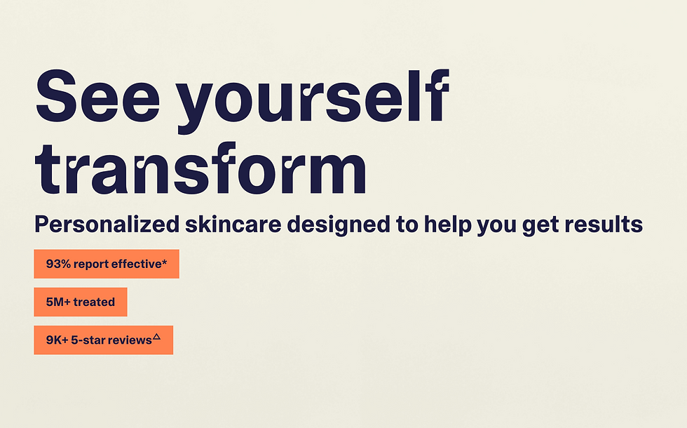
Curology
See yourself transform: Personalized skincare designed to help you get results.
HelloFresh
Take the stress out of mealtime
This is why brand strategy is so important! At Fictorium, we believe that brand strategy goes hand in hand with design as it informs how your brand should look, feel & sound. Well-designed visuals build trust in your audience as they see your product as expensive and refined, while messaging drives the selling point that your product is able to fulfill a desire they're hoping for.
02 / Ensure intuitive navigation
The navigation of your website should be easy and intuitive to use for your audience at every age. A website may look very cool with a lot of features, but audiences may leave your site if they unsure about how to navigate through it. People don't want to work harder than they have to, and if it takes more effort to figure out how to get to a certain page, they will duck out (also known as "bounce rate").
When designing a homepage for our clients, we first identify the top 3 actions clients they want their customer to take before diving into any design work. Going back to the specially made pillow example, the client may want their customer to 1) Take a quiz to find their best suited pillow, 2) Shop bestsellers/all products, 3) View order status. With all three aspects in mind, we would design the homepage that allows easy access to each of these touch points so that the customer is able to go through the website intuitively without any second thought.
Assess your homepage and decide what top 3 actions you want your customer to take. Then ask 5-10 people within your target audience to see if they are able to navigate to those pages easily. If you see any hesitancy or confusion, that might mean you'll need to restructure a few aspects of your site so that the process of accessing a product or inquiring information is easy.
T I P
To get accurate and unbiased feedback, we highly recommend asking random people, acquaintances, or a friend whom you know will be very honest with you.
Sometimes the closest people in your life may be very gentle with you about their feedback because they ultimately want to support you with encouragement! Nothing wrong with that :) but their feedback may not be very helpful in ensuring your website is at its tip top shape.
03 / CTAs don't have to be boring!
An effective way to help potential customers interact with your product is to place call-to-action buttons around your website that are easy to find. Include a few CTAs throughout your homepage so that as your audience is learning about your product, they can easily take action to further their engagement.
Be sure the CTAs stand out and are visually striking – perhaps in a color that contrasts with the background of your homepage. Keep the copy up to 3 words and write it to be action-oriented so that your audience would want to engage further with your product. A few examples are "Sign Up", "Contact Us", "Shop Now".
One key aspect to note is to not litter your homepage with too many CTAs. Be sure to intentionally place them in areas that are appropriate but are not too repetitive as it can be annoying for the viewer. Be creative in how your CTAs are displayed - they don't always have to be in the form of a button! Utilize the sections with fun ways of exploring your product. Below is an example of our website design for Teeny Tiny Marleigh Cakery.

A good rule of thumb is to include a CTA in your header so that your audience can quickly engage with your product, so the first CTA to "Shop Teeny Cakes" is seen above the website fold (meaning the first portion of your homepage that is immediately visible without having to scroll down). The next CTA encourages viewers to choose a flavor they're interested in, enabling them to explore the product in an engaging and fun way. The last CTA in this screenshot is seen as a link after a short blurb of the benefits of this product - being able to try multiple flavors in one sitting.
04 / Feature your product's benefits
Now that you've introduced your product, your audience wants to know about the benefits of engaging with your product. Include 2-3 of the top benefits within a section of the homepage and keep the copy light. It also helps to add a few visuals such as photos of your product or illustrative icons. Below is an example of our website design for Sidekick Milk & Cookies:

Another approach is to include a comparison chart to highlight the unique aspects of your product that make it stand out from your competitors. Here is an example from Graza:

05 / Highlight reviews of transformation
Reviews give potential customers the advantage of going second. Instead of highlighting general sentiments on your homepage, showcase reviews that tell stories of lives transformed by your product. People are drawn to transformational stories because they desire that same experience for themselves, and this will make them more enticed to engage with you. A way to receive specific reviews is to include these questions to generate the best response:
What problem were you experiencing before discovering our product?
What was unique about our product?
When did you realize our product was working to solve your problem?
How does your life look like now that your problem is solved?
Showcasing these stories would allow your business to grow faster because it speaks to people's inner desire to grow into their aspiration.
06 / Include awards, press or successful stats
Showcase any awards you've received or links to press articles that featured your product! Include logos of companies that gave you recognition as it will bring more credibility to your product. Your audience will see you as a trusted source and will be more inclined to buy or further engage with you. Additionally, you can highlight successful statistics to show how effective your product is. Below is an example from Curology. Statistics of their product effectiveness is displayed right underneath their header message, showcasing their high success rate with a large 5 million audience.
Don't feel like DIYing your website?
Building your own website can be overwhelming, but it doesn't have to be! At Fictorium, we absolutely love helping founders build beautiful and intuitive websites! So if you want expertise on your site, we would love to work with you! Here are some links to learn more about our process and get started on your project:

