Kindred
[INTRO]
Designing a bold yet welcoming brand for a new church plant rooted in Biblical truth—inviting a post-pandemic generation into Gospel-centered community, growth, and belonging.
[SERVICES]
+ BRAND IDENTITY
+ ILLUSTRATION
+ WEB DESIGN
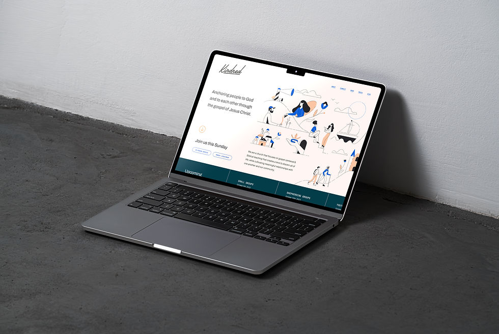
[DETAILS]
Kindred was founded in Artesia with a desire to build genuine relationships and share Biblical truth through local outreach. As a new church plant emerging from a season of post-pandemic isolation, its mission is to offer a warm, welcoming refuge, a place where connection, care, and Gospel-centered community can thrive.
With that in mind, we crafted a brand identity that feels bold, energetic, and dynamic, mirroring the church’s uncompromising stance on Biblical truth in a culture filled with competing worldviews. At the same time, the branding balances approachability and warmth. The logo reflects Kindred’s adventurous yet hospitable spirit, with a fluid upward motion that conveys growth and momentum, while soft curves in the letterforms add a human, inviting touch. Its contemporary look is designed to resonate with a younger audience, offering a fresh expression of the church’s values and a visual invitation to belong.
The illustration system brings Kindred’s core values to life, serving, accountability, outreach, and discipleship, through engaging depictions of people in community. Thriving flowers represent transformation through God’s Word, while a lighthouse stands as a symbol of the church’s role as a beacon of the Gospel, guiding others (represented by boats) toward belonging in God’s family.