top of page


Lois + Clark
Optometry
+ VISUAL IDENTITY
+ PACKAGING
+ ART DIRECTION
+ PRODUCT DESIGN
Clear vision should not be an inconvenience. Lois + Clark has purposefully designed every aspect to optimize optometry for your everyday needs. Each pair of contact lenses is easily accessible from a specially made canister which keeps track of each month's rotation in a year. Consumers are able to effortlessly change their contact lenses when needed, enabling them to save time and keep their eyes healthy.
RECOGNITION
Graphic Design USA 2017 American Package Design Award
PRODUCT DESIGN BY JIBUM JUNG


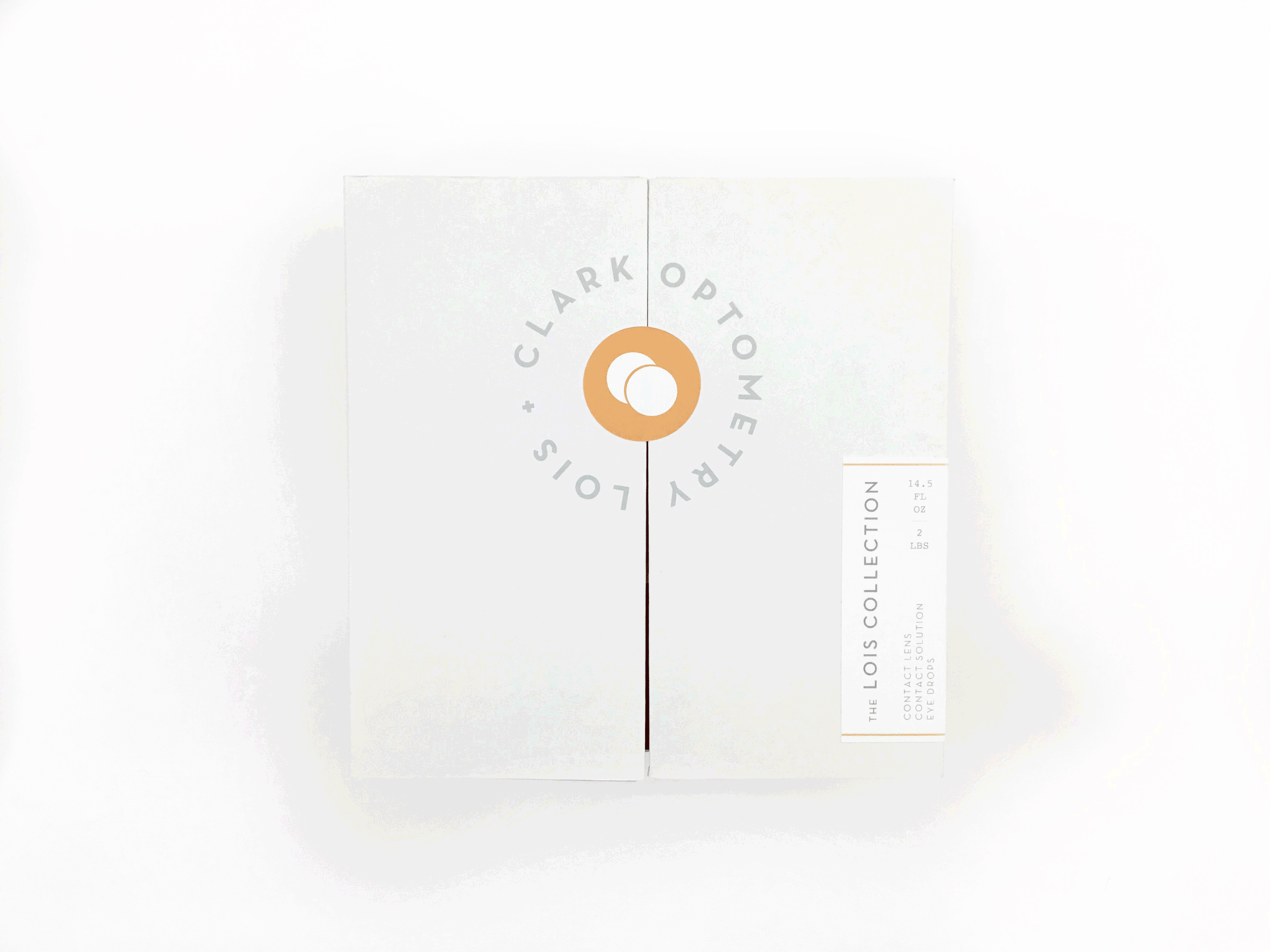
The brand's design is driven by the concept of going from ordinary to extraordinary. Just like how Clark Kent goes from ordinary journalist to extraordinary superhero, Lois + Clark embodies that value within its design. The opening ceremony in the packaging design emulates the action of Clark Kent pulling his shirt open to reveal his superhero identity.

bottom of page